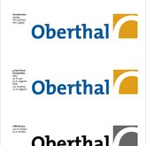
Logo Oberthal
- Logo
- Corporate
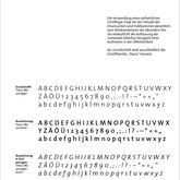
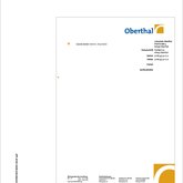
Once again an example for a reduced design that should be easy to use. See the manual we did for them. Common project with my former partner Thomas.
Later these guy came with the infinitly sad »We dont need you anymore, we have ADOBE now!« and started to tear the design down.
Again, I use their »work« as bad examples for my students – they understand.
However, I still like this logotype, it is a strong brand.


