
AQC Aero
- Logo
- Traffic
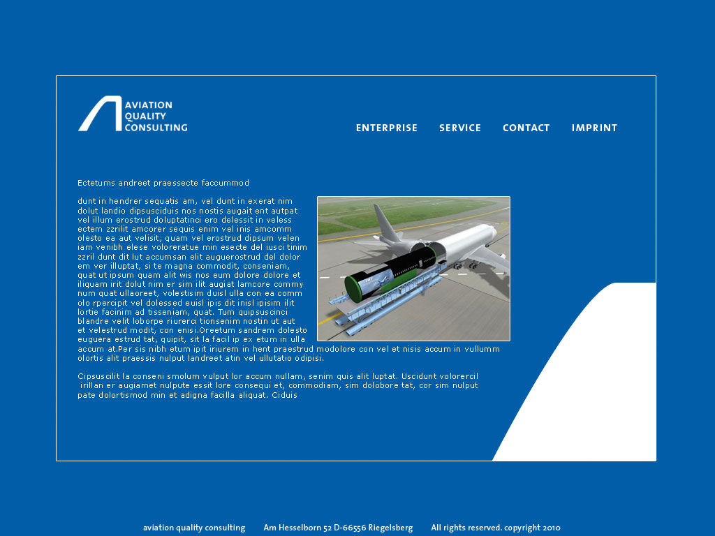
2010. The customer – a 747 cargo pilot – starts a consulting company for the aviation industry. The idea of w white fin against the blue sky came fast and so clear, the rest followed instantly. Liked working on it – reduced and timeless. Would do it again in the same way. Looks a bit like NASA ;-)
The other corporate design elements like papers, business cards, web were also easy to design.
See more: Link