Route 66 – Design for a dental practice
- Logo
- Corporate
I did some layouts – see »refused« – but at the end a dent did it. Because Isabell and Björn ar true rockers too, they liked the idea of a sign like the »Route 66« shield. Well, I draw an dent and … her it is.
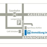
The »66« comer from their adress in Saarbrücken: Bahnhostraße 66. That simple.
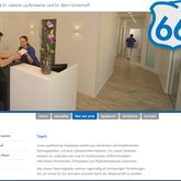
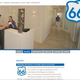
And it works very well on every design or surface. We also cutted it on adhesive film to name rooms of the dental practice and to protect from outside looking in.
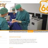
A second one, the orange logo, followed, its the corporate color of the dental surgery


