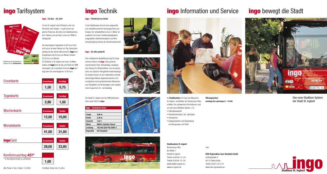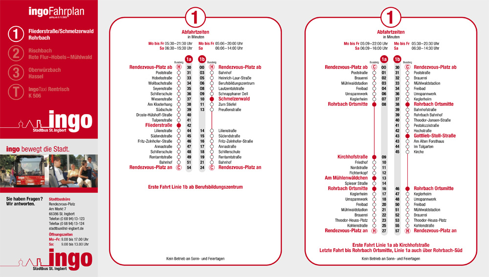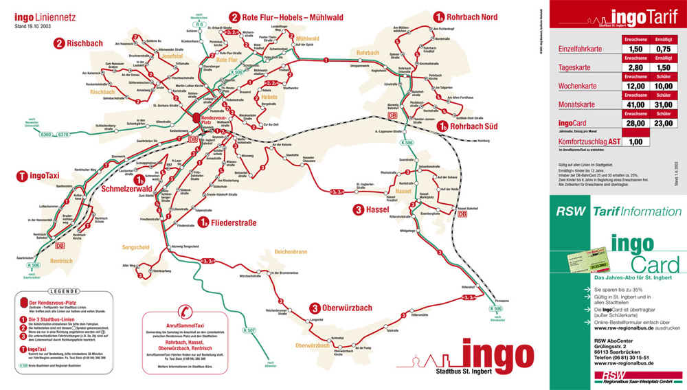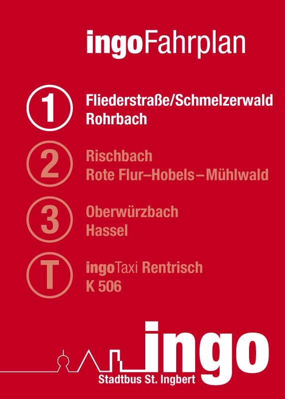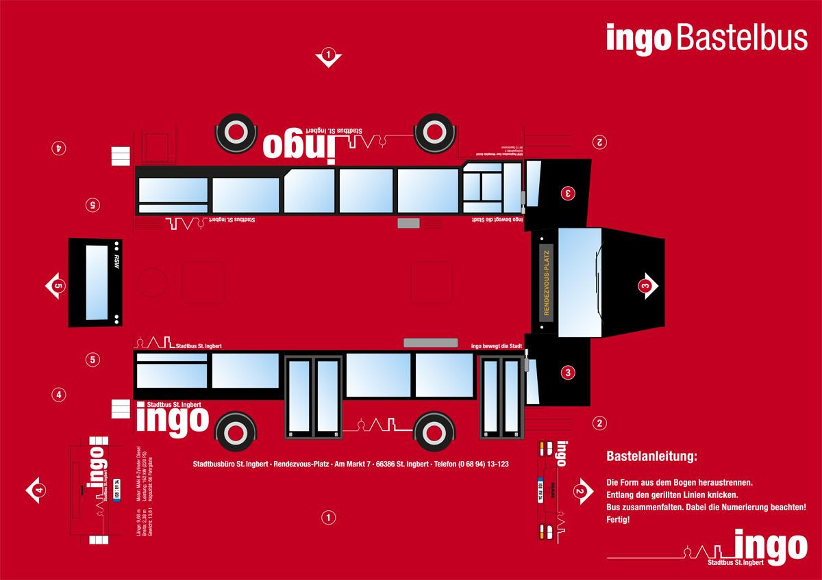

Ingo – City Bus System St. Ingbert
- Logo
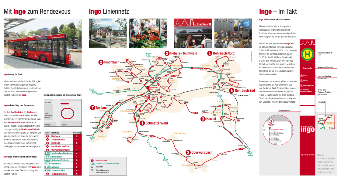
- Maps
- Traffic
That was a good one. I liked it very much, because it was so complete. All my experiences in traffic design were needed to build a citybus corporate design, which worked so well. Im very proud of it.
I won the pitch against 3 other design offices, creating logo and slogan.
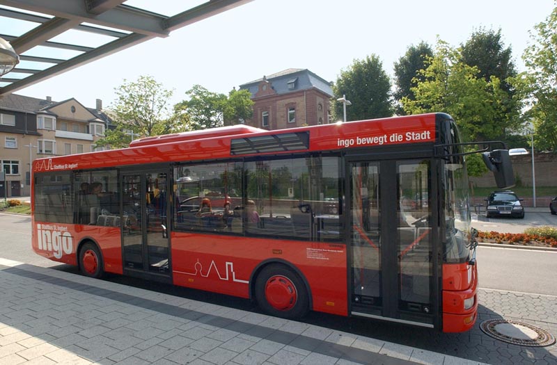
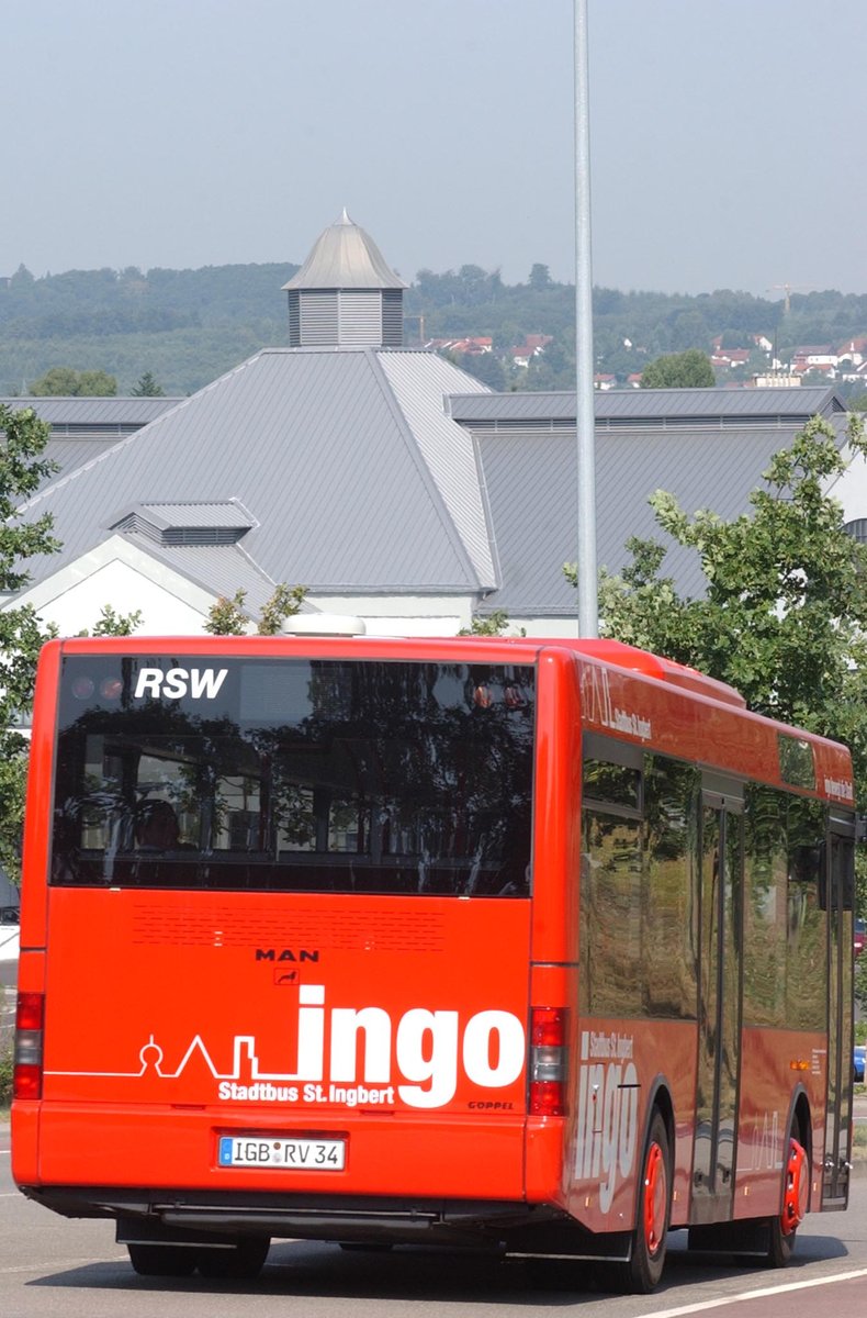
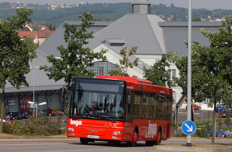
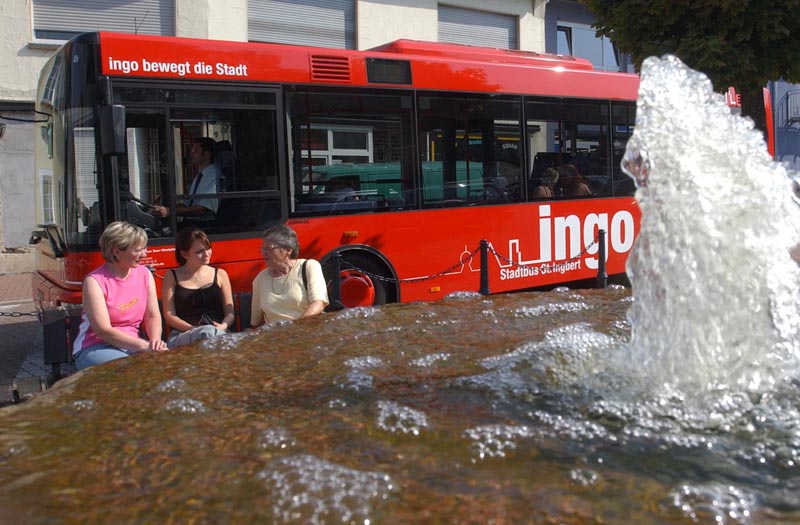
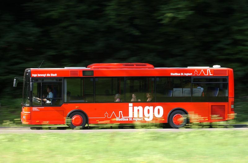
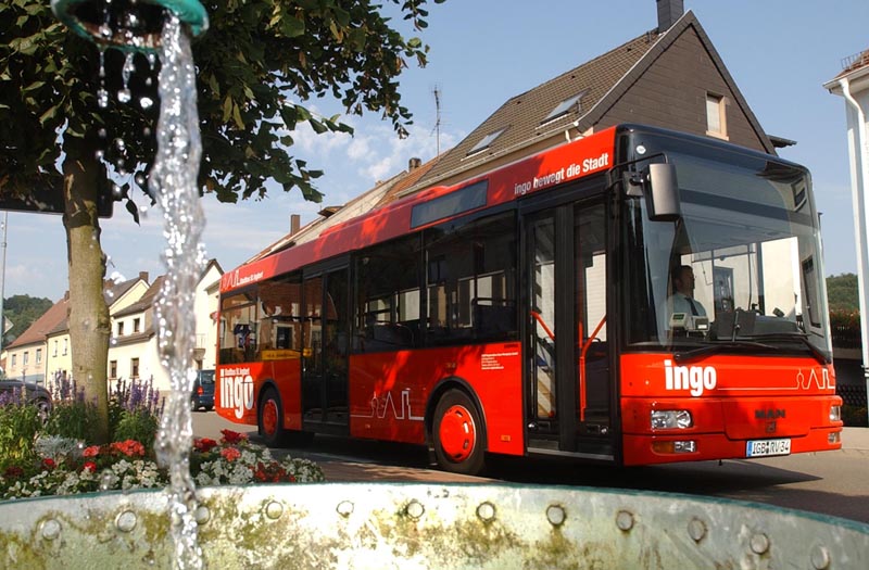
The challenge was huge, I had to include an existing logotype of the city in our design. And the slogan. But at the end it worked well and still does. The acceptance under the citizens was great from the start, and I'm very happy every time I visit the town to see the bus stop signs in their shiny red color, doing so well in the cityscape.
Work done:
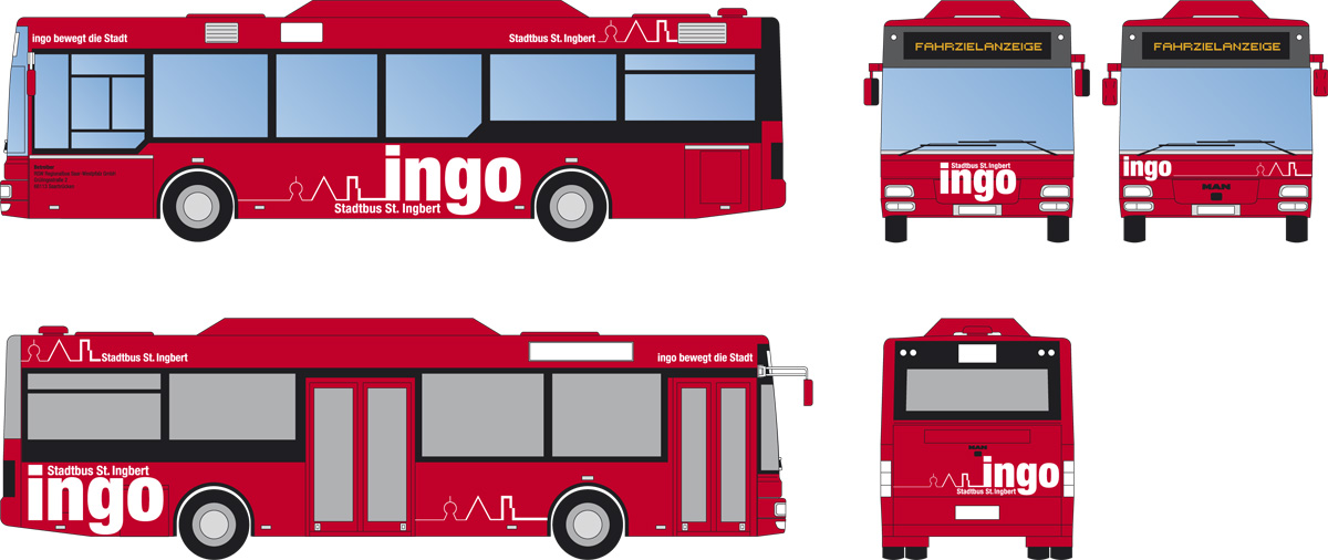
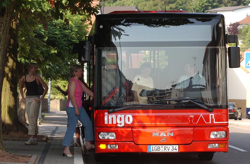
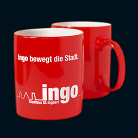
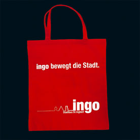
- general logotype color and b/w · slogan
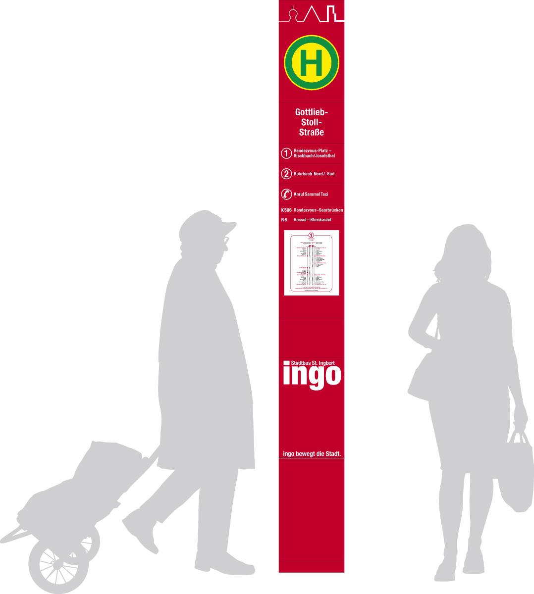
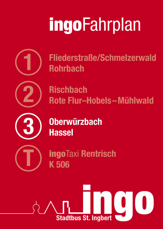
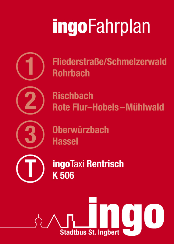
- Bus label and bus stop signs
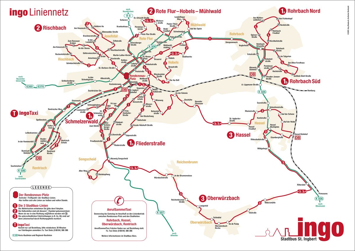
- bus map
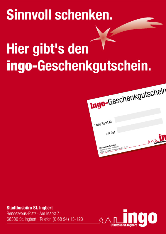
- flyers, folders, timetables, invitations et cetera …
- give aways and merch stuff
Later I lost the control over the design, the ugly »we dont need you anymore, we have ADOBE too, Sir!« unfortunatlty tooked place here too.
But the absence of experience and knowledge does not bother me very much. I use my old designs to teach my students to clarity and reduced layout. I use their »work« as bad examples of design, esp. the bus map is terrific overloaded today.
See also some ideas for this pitch under the »Refused« button.
I like traffic design and I would like to do it again. Perhaps there is some …