
KEW – refused
- Refused
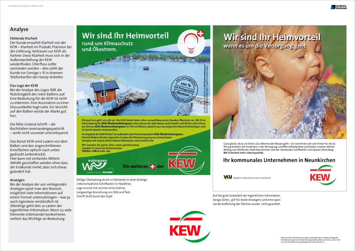
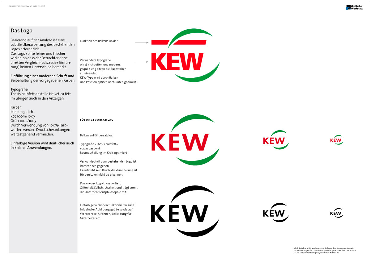
They were unhappy withe their old logotype. It looked bold and stiff. Also it carried an useless element, a bar?
See examples.
We reduced the weight of the typo and modified the proportions subtle. That was it.
We lost. But it worket very well in application. What a pity.